Xero global navigation
2024, SaaS, Australia
DELIVERABLES
Design research
Product strategy
Wireframes
Prototypes
User experience
ROLE
UX lead
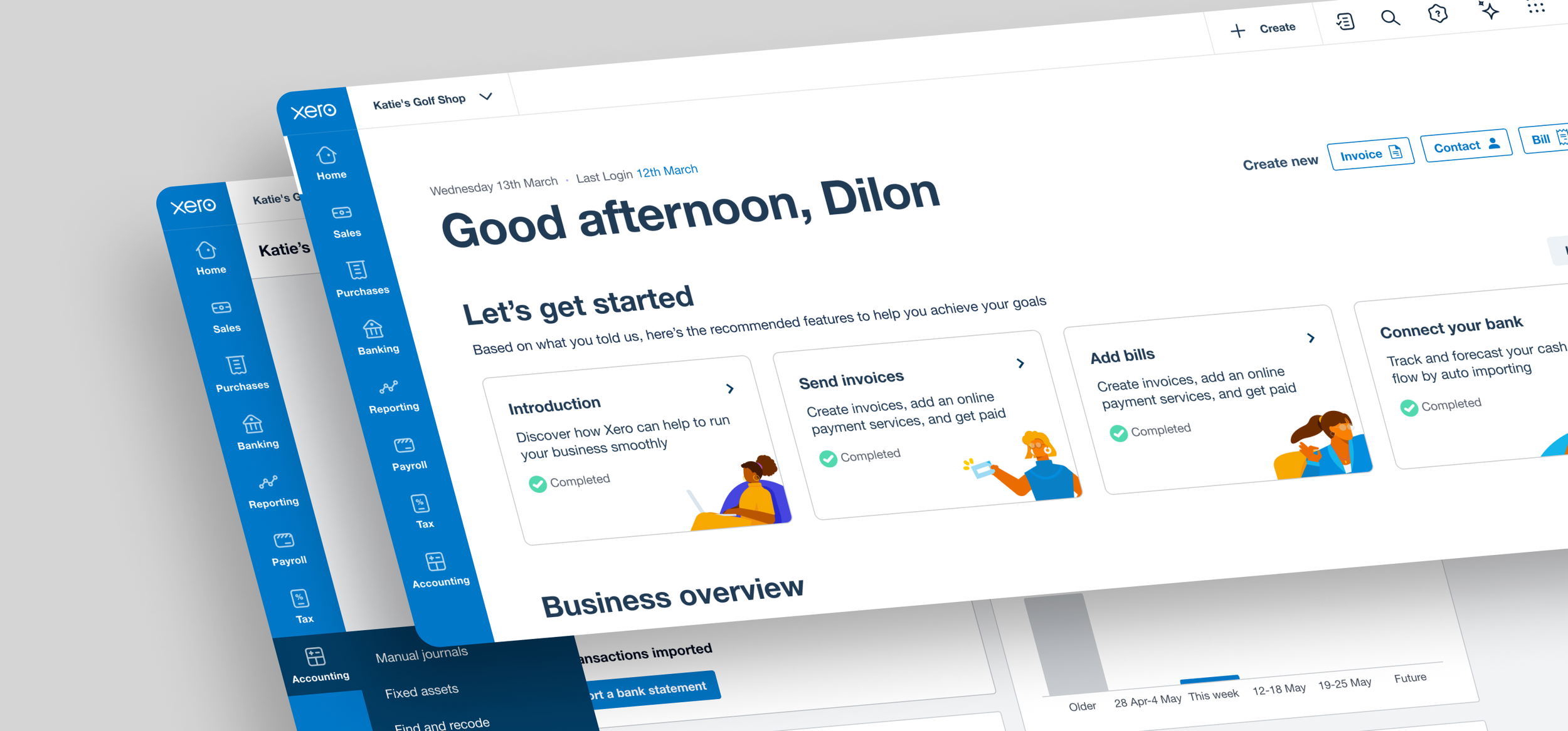
The wayfinding of Xero, built for efficiency
Xero is a SaaS accounting software designed to help small businesses manage their business anytime, anywhere.
As the global web experience team, our mission is to improve learnability and findability of navigation (top and side panel) to empower small businesses to get their jobs done efficiently. Over the past eight years, the web has grown fast, but we haven’t taken the time to think about how all the different roles and regions mesh together in one web experience.

Current state of Xero navigation (top and side panel)
Achievements
Successfully launched the new navigation experience in beta in June 2025
Achieving 70.7% positive responses in CSAT within the first month
“The new menu structure MAKES SENSE! It’s just brilliant…Whoever’s leading the design deserves a round of applause.
I did not even notice the change at first. It just worked. That’s the sign of great UX.” — Beta user
Goals
Navigation is being rebuilt, with the following goals in mind:
Complete key JTBD more effortlessly – A more intuitive navigation means users can more easily find where to go on the first try
Onboard to Xero faster – A well-designed navigation gives users a good overview of what a product offers
Modernise the look and feel – Bring the marketing brand into the product experience as part of the broader UI Rebuild project
Dependencies
All teams will need to add the new navigation to their pages
The teams owning global tools, such as Global Search, will need to move their content to the new panel
Waiting on UI Rebuild for final typography, colour palette etc.
Success criteria
If you do a fantastic job, what would improve? What can’t change / remain constant?
Minimise disruption for existing users
Key pages are just as easy or easier to navigate to than currently
Fewer CX tickets about being unable to find navigation items
EmpathiseResearch methods
‘We don’t know what we don’t know’
We've conducted 10+ rounds of extensive research this year, informing the re-imagination of the small business journey, covering areas that include, but are not limited to:
Desk research: To leverage past research and data from Google Analytics to understand what we know and what we don’t know in order to identify the gaps.
Competitive Analysis: To examine direct and indirect competitors to identify best practices in sidebar design, analytics presentation, and interaction cost reduction, guiding our approach.
UX Heuristics: A heuristic evaluation of the original sidebar design to pinpoint usability issues, helping prioritise improvements for a better user experience.
Open card sort: To understand users' mental models of content grouping and the terms or labels they give each category, with the aim of informing future design and product decisions.
Tree test: To understand whether the current navigation is intuitive and allows people to easily and quickly complete their tasks. Also, to establish our benchmark to enable teams to understand, measure and track the quality of information architecture (IA) changes over time.
DefineDefining the problem
Here are five key themes that we've learnt:
Broad, unintuitive groups make it harder for new users to predict where features live
Accounting jargon and/or ambiguous labels create a barrier to understanding what Xero offers
Parts of our navigation aren't easy to discover so useful features are underutilised
Navigation doesn't offer obvious and efficient ways for some key jobs and workflows to be done
The limited customisation we have in our navigation is not intuitive and flexible
DevelopUse, iterate, repeat
Among 6 aspects (including information architecture, navigation, right-hand side panel, settings, permissions, and keyboard shortcuts) of Xero web to improve findability, below are three main focuses:
Information architecture (IA)
Interactive navigation
Unified right-hand side panel
Focus 1Information Architecture (IA) behind the pixels
Compared to the current state, the success rate increased from 36% to 72%, indicating that the new IA provides more intuitive navigation for customers, as demonstrated by a series of tree tests.
A series of tree tests
To compare the proposed IA with the existing IA to see whether findability has improved.
We developed the best-guess new information architecture mindmap, with a strong focus on getting jobs done, user roles, and regions to refine the intuitive IA and labeling. To test the assumptions on a series of tests by using Treejack.

Comparison of task success scores for each round

Ideation and collaboration with domain teams
Focus 2Building for familiarity, scale and clarity
From the bold assumption of moving navigation from the top to the left, we iterated until we gained confidence that the top navigation bar was perceived as clean, non-intrusive, and easy to use through several rounds of evaluative testing.
Evaluative test (R1)
Discover which variants (see below) enable the most intuitive and low-effort navigation experience, and which raise red flags. This will help us identify which design variants to evolve and which to eliminate.
key findings
The perceived impact of a LHN and new IA was low. Xero users were indifferent about the change.
Most participants preferred Concept B, which included icons with small labels underneath.
Icons only (Concepts A and D) performed poorly because icons required mental effort to understand and learn, and the hover interaction was perceived as inefficient.
Most preferred when the L2/3 menu was closed when completing tasks (such as focussing on a report) because it maximised screen space and minimised clutter.

Evaluative test (R2)
We learnt from R1 with customers. Xero users were indifferent about the navigation moving from top to left.
“It doesn't look hugely, hugely different but it feels easier to use maybe.” - SB
“It's already user friendly. This doesn't really matter to me.” - SB
What decision we inform
We need to decide on a direction for the UI of the main navigation – a direction that we would feel confident rolling out not only to Xero Blue, but to Practice tools as well. We need to gain more confidence in our direction and establish a sound justification for our decision.
Key findings
Most ABs (67%) prefer the Top navigation. Their preference was primarily driven by familiarity with the current state.
SBs were evenly split in their preference for Left and Top navigation. Further analysis showed a slight difference between Xero and non-Xero customers:
Xero SB customers preferred the Top nav (55%)
Non-Xero SBs preferred the Left nav (56%)
The Top nav is perceived as familiar and intuitive while the Left nav is perceived as modern and unintrusive.

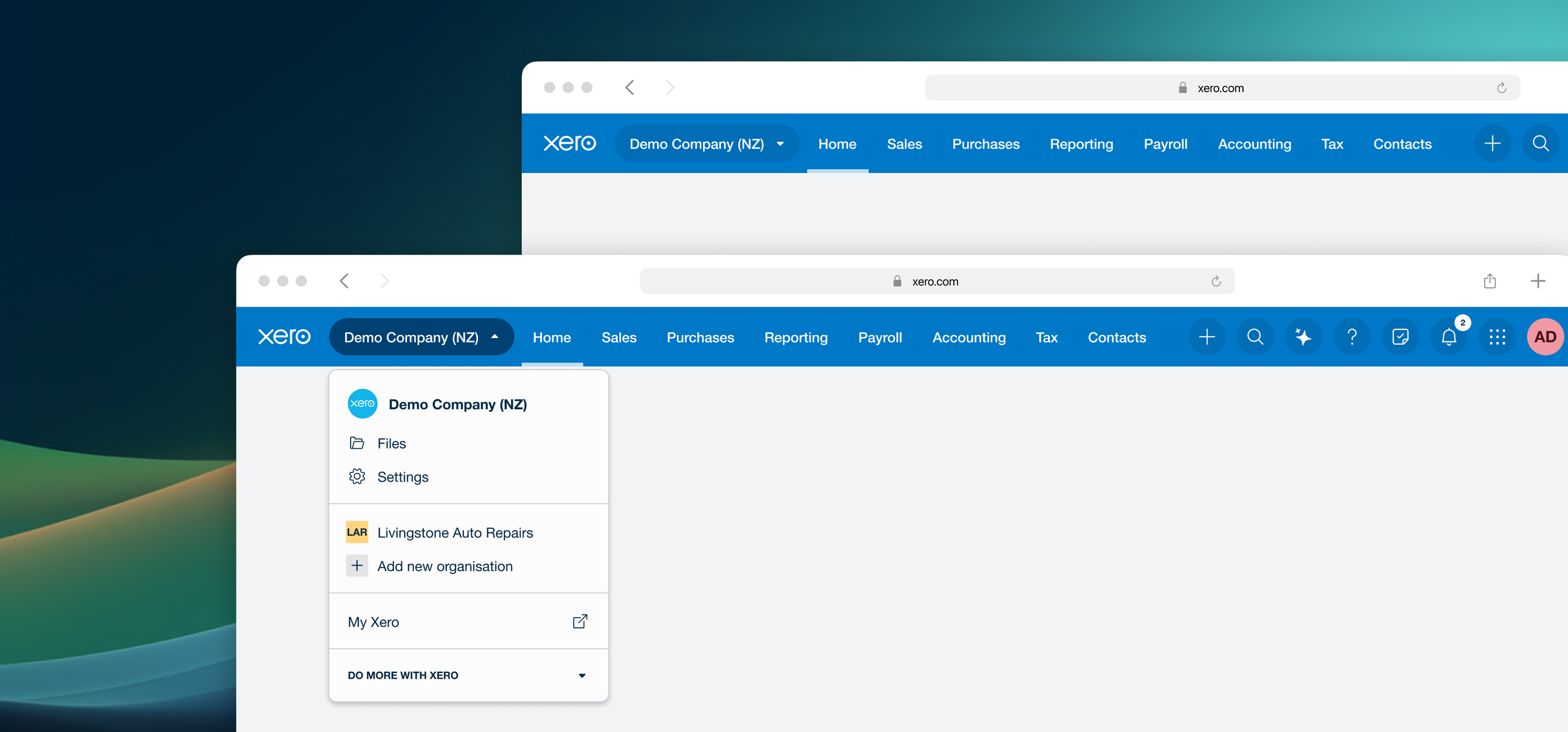
Focus 3One-sided panel for all
The navigation bar and side panel were perceived as clean, non-intrusive and easy to use by most as it save time when navigating between pages.
Holistically evaluative test
We have decided to move forward with the top navigation concept, introducing a new UI and refined information architecture (IA). We have also revamped the right-hand side panel from various to standardise its size, styles, and structure into a consistent header, footer, and card layout.
Why we do this study
To holistically evaluate the latest version of the top navigation, information architecture, and unified side panel, identifying any risks and areas for improvement
To enhance the right-hand side panel usability and provide users with quicker access to additional features
To build greater confidence in our navigation concept
key findings
The information architecture was intuitive; participants quickly and easily navigated through Xero.
The navigation bar and right-hand side panel were perceived as clean, non-intrusive and easy to use.
Navigating home via the Xero logo was not intuitive.
The perceived impact of a new navigation experience was low—due to it’s intuitiveness—but participants did expect an initial learning curve.

Various sizes, styles on side panel


What we tested
DeliverDriving adoption: Make it easy
The challenge was consolidating components between the current XUI and the new design systems. We worked closely with the XUI team and engineers to determine how much we could change while ensuring that everyone could use them correctly. To address this, we created a navigation library that became the single source of truth for our designers.
To support this, we developed several resources. One key resource was a component library and a Figma spec template that guided designers through every consideration, from accessibility and responsiveness to empty states and content design. Another was a set of Confluence pages, complete with permissions, regional variations, and clear usage guidelines.


Impact
Strategic Impact
Product strategy pivot backed by research insights.
This track of work has left a strong legacy and a comprehensive playbook for the org to leverage.
Stakeholder collaboration Impact
Designed new strategies and company-wide processes in Xero stakeholder collaboration.
UXR had become a strategic partner of the product team.
Product Impact
Through collaboration, designers were able to quickly relay feedback from research and incorporate it into the prototype - Agile!
Planning the launch
As a global navigation team, we have a dependency on the domain team to build a service. I wanted to make sure that we were planned and prepared for any questions that might arise. Our PM and I developed a Product Requirements Document (PRD) outlining the development timeline, proposed test plans, and success metrics to achieve this.

Product roadmap (Generalised)
Design is never done
As a significant milestone, we will launch this new navigation in mid-2025, but it’s just the foundation. We know the design will continue to evolve as it moves from Beta to General Availability, an essential part of an iterative, user-centered process.
At the same time, we're looking ahead. We’ve begun shaping the future of wayfinding, exploring how we can help users navigate more intuitively and complete their daily tasks more efficiently.
Keyboar shortcuts
Search for navigation menu items from search
Integrate My Xero, Xero Green in the global navigation experience